


Your Custom Text Here
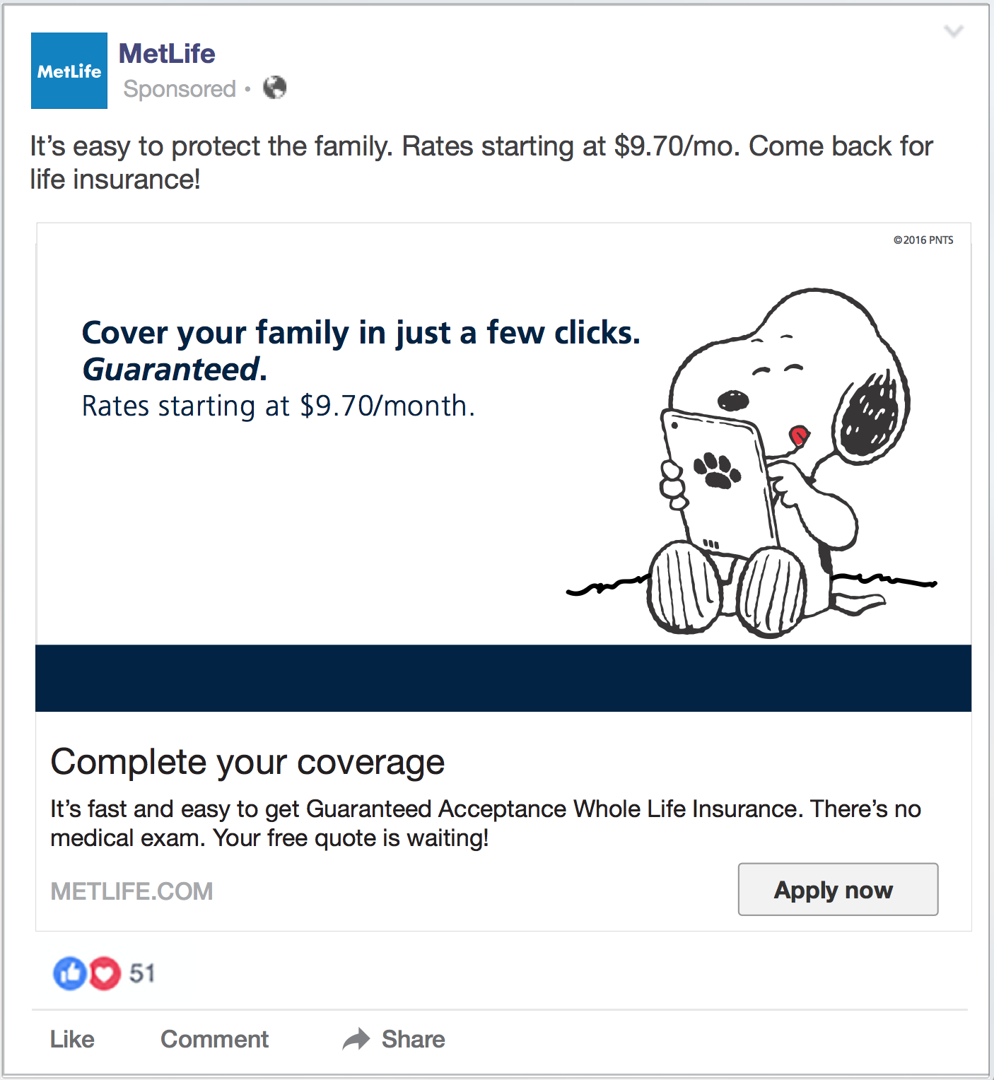
Metlife is an insurance company that has been around for some time and is well recognized. However they over recent years stepped away from past branding of Snoop and the Peanuts gang. MetLife felt it was time to establish a more mature look that could be trusted. Also being able to reach a broader audience had been a challenge.
During the start of our time with Metlife the original Peanuts branding was still in play and did display a sense of a friendliness and familiarity. Despite the characters being cartoons keeping clean simple layouts was key to keep a sense of seriousness. As we transitioned away from Peanuts to their new lifestyle based branding a combination of iconography and imagery was considered. Eventually the style of iconography did become more linear or simplified and Peanuts characters were fully transitioned out.
MetLife did also change their logo and added new secondary and tertiary accent colors to still keep a fresh but clean look. Incorporating the right life style imagery was also highly considered to assure nothing was too commercial or un-relatable. MetLife continues to be well recognized in the insurance world with an ever-growing amount of customers worldwide.